Customised Website
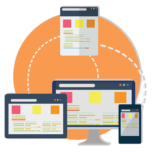
We design responsive websites and applications that are guided by research for both mobile and desktop friendly, that are focused on the end users and tailored to meet business goals.
Customised Website
Design & Development.
We design responsive websites and applications that are guided by research for both mobile and desktop friendly, that are focused on the end users and tailored to meet business goals.

Discovery
Our process starts with a kickoff meeting to better understand your business goals and priorities to create a suitable but responsive website design. Before the first line of code is written, we get to know your business, your goals, your customers and the problems we want to solve. Next, we analyze your customers; we assess their traits and behavior and use them as the foundation for all web design and development. We work closely with you to establish a more responsive and effective structure and flow of your website. This way, we can confirm the flow of the site in the long term, this is extremely advantageous for marketing and persuading your customers. We will explore the best path to lead your visitors into the funnel and keep them focused on the task at hand. Working closely with our design team is key to the success of your website. Our web design process is built around collaboration and consistent responses. Throughout the website design process we encourage feedback to ensure our web designs meet your expectations.
Key Highlights
Completely custom
We design custom websites from scratch, which makes them unique and tailor-made to the needs of our clients. Rest assured that we do not use any templates. Therefore, our web designs are not restricted in any way or form.
Completely custom
We design custom websites from scratch, which makes them unique and tailor-made to the needs of our clients. Rest assured that we do not use any templates. Therefore, our web designs are not restricted in any way or form.
Responsive design for all devices
Gone were the days where visitors can only visit your website via computers. Our web designs are both desktop and mobile responsive!

Responsive design for all devices
Gone were the days where visitors can only visit your website via computers. Our web designs are both desktop and mobile responsive!
A CMS that works for you
Whether it is our own self-developed content management system, Vulcan or open source framework like WordPress, we customize your CMS to allow you to update the website easily and efficiently to ensure the responsive web design remains up-to-date.
A CMS that works for you
Whether it is our own self-developed content management system, Vulcan or open source framework like WordPress, we customize your CMS to allow you to update the website easily and efficiently to ensure the responsive web design remains up-to-date.
Warranty coverage
We want to make sure that you get the most out of your website and your online presence reaches its full potential. As we are confident of our work, we provide an extensive website warranty and maintenance policy for the solutions we build, so that you will get a peace of mind even after your website is LIVE.
Know Our Process.


Planning
We start by delivering sitemap and wireframes to ensure the site architecture, layout and hierarchy are ironed out before design begins. Setting a solid foundation is an integral part of our web design process to ensure the web design is productive. Following this, we move into UX (user experience) planning with the approved wireframes. We make sure each step builds upon the previous one and that the ends are kept in mind.

Design
Wireframes drive the user experience, but it’s in the design phase that we can flex our creative skills and innovate visually. Our responsive web design strategy creates an interactive user interface and flat designs of the major pages and page systems to establish a solid foundation to build upon. We present the site as it evolves and comes to life in multiple design and revision rounds.

Development
Responsive design is standard for us. We build our websites on customisable frameworks, which comes with a good user-interface CMS for our clients. We start coding as soon as the wireframes are approved, and our design, front-end development, back-end development and marketing teams work seamlessly to complete the website. If you are new to CMS, please do not hesitate to contact our support team here.

Testing & Live
Finally, we do a final speed and performance analysis across mediums. It’s the final 10% that turns a good site into a great one!
